We've completely rebuilt how SiteVitals monthly reports work - from what data they capture, to how they look in your inbox, to what you see when you open them in the dashboard. Here's what's changed and why it matters.
Scores you'll actually recognise
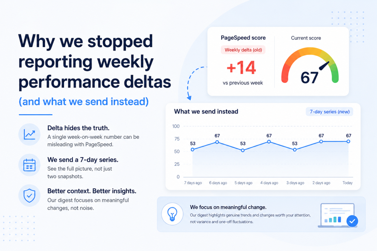
Previously, monthly reports showed averaged scores across the whole month. This caused confusion - you'd fix an issue mid-month, see your dashboard showing a healthy 93, then get an email saying your score was 78. The average was technically correct but practically misleading.
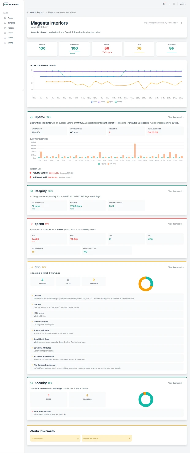
Now, the scorecard at the top of every report shows your end-of-month score for each area: Uptime, SEO, Security, Speed, and Integrity. These are the numbers you'd have seen on your dashboard at the close of the month. No more head-scratching about why the email doesn't match what you're seeing.
Alongside each score, you'll see a month-over-month delta - a small arrow showing whether that area improved, declined, or held steady compared to the previous month. At a glance, you know what's moving in the right direction and what isn't.
Charts that tell the story
Numbers are useful, but trends are what really matter. Every report now includes a score trend chart showing how your SEO, Security, Speed, and Integrity scores moved throughout the month. A steady line means stability. A dip and recovery tells you something happened and got resolved. A gradual decline tells you something is slowly getting worse.
The uptime section now includes a daily response time chart showing both average and peak response times for each day of the month. Latency spikes become immediately visible - you can see exactly which days your site was slower than usual and correlate that with any changes you made.
SEO and Security sections each include a small breakdown chart showing the proportion of passing, failed, and warning checks. It's a visual complement to the numbers that makes the balance between healthy and problematic checks instantly clear.
All charts adapt to dark mode automatically if you use it.
Specific issues, not vague summaries
The old report summaries were generic: "Your security checks remained in good shape" or "Some SEO issues were detected." Useful? Barely. You had no idea what the issues were without clicking through to the dashboard.
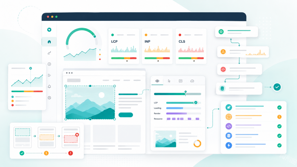
Now each area includes the specific details that matter. Your SEO section tells you exactly how many checks passed, failed, and triggered warnings - and names the specific issues, like a broken link or a missing llms.txt file. Security lists the actual failed checks by name. Speed shows your Core Web Vitals - LCP, FCP, CLS, TBT - with colour-coded thresholds so you can immediately see what's good and what needs work. Integrity tells you your SSL and domain expiry countdowns and any broken assets detected.
The goal is simple: you should be able to read the report and know exactly what needs attention without opening anything else.
A month-in-review narrative
Every report now opens with a plain-English summary of the month. Something like: "A mixed month for acme-widgets.co.uk. Improvements in SEO (+5). Declines in Security (-2). 1 downtime incident recorded." It gives the report a human feel and tells you the headline before you look at any numbers.
A redesigned email
The monthly email has been rebuilt from the ground up. At the top, a colour-coded scorecard strip gives you all five scores at once - green, amber, or red - with the change from last month. Below that, each area gets a concise summary with the key details and a link straight to the relevant dashboard.
We've also added SSL and domain expiry warnings that surface prominently when renewal deadlines are approaching, so these don't get buried in the detail.
The email subject line now includes your top scores, so you can see the headline numbers before you even open it. Something like: "Acme Widgets - March Report (SEO 85, Security 93, Speed 72)".
Share reports with anyone
Every report now has a share button that generates a temporary signed link. Send it to a client, a colleague, or your boss - they can view the full report without needing a SiteVitals account. The shared view includes everything: the narrative summary, scorecard, charts, and detail cards. The link expires after 72 hours.
This is especially useful for agencies who want to send a monthly health snapshot to clients without giving them dashboard access.
Blog posts from SiteVitals
The monthly email now features recent posts from the SiteVitals blog - practical insights from what we see every day helping clients of all sizes get more from their websites.
What's next
We're considering PDF downloads and white-label branding for agency users in a future update. If either of those would be useful for you, we'd love to hear about it - just reply to any monthly report email and it comes straight to us.
All of these changes are live now. Your next monthly report will use the new format automatically. If you'd like to see it in action right away, head to the Reports section in your dashboard - the current month's report updates daily.

Articles written collaboratively by the SiteVitals team.